Drag & Drop Module
A comprehensive module for Inductive Automation's Ignition Perspective framework, enabling intuitive drag-and-drop functionality with UDT-aware view binding transfer, built-in table integration, acceptance filtering, move/copy semantics, and fully customizable styling for industrial HMI applications.
Overview
The Drag & Drop Module extends Ignition Perspective with three specialized container components that enable users to create dynamic, reconfigurable HMI interfaces. By leveraging UDT (User Defined Type) structures and tag bindings, this module allows operators to drag views between containers while automatically preserving and transferring data bindings.
Primary Use Cases
- Dynamic Dashboard Building: Allow operators to customize their workspace by dragging equipment views to preferred locations
- Equipment Comparison: Drop multiple equipment views side-by-side for real-time comparison
- Context-Aware Displays: Automatically select appropriate views based on the UDT type of dropped data
- Data Collection: Gather tag paths from dragged sources for alarm lists, trend charts, or reports
Architecture
The module consists of three primary components that work together to enable drag-and-drop functionality:
Source Component
or
DataDropContainer
Target Component
Data flows from source to target via the global dragDataStore, carrying component definitions and captured binding configurations.
Component Types
| Component | Type ID | Purpose |
|---|---|---|
| DraggableContainer | dragdrop.draggable.container | Wraps a view to make it draggable; captures binding configuration from child or parent view |
| DroppableContainer | dragdrop.droppable.container | Accepts dropped views; recreates embedded views with transferred bindings |
| DataDropContainer | dragdrop.data-drop.container | Captures tag path data from dropped items without recreating views |
Installation
.modl file through the Ignition Gateway's Config > Modules page. The module will automatically register its components with the Perspective framework.dropConfig in their view properties to enable UDT-aware drag-and-drop functionality.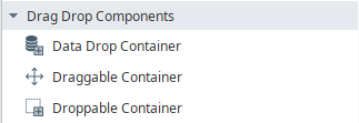
DraggableContainer
The DraggableContainer is a wrapper component that makes its child view draggable. When a drag operation begins, it captures the component definition and any binding configuration, packaging this data for transfer to a drop target.
Properties Reference
| Property | Type | Default | Description |
|---|---|---|---|
| dragEnabled | boolean | true | Enables or disables the drag functionality. When disabled, the container behaves as a normal container. |
| dragType | string | "copy" | Determines what happens to the source widget after a successful drop:
"copy"
"move"
copy keeps the source widget in place. move automatically removes it from the parent DroppableContainer after a successful drop. Move only works when the DraggableContainer is inside a DroppableContainer.
|
| dataSource | string | "child" | Determines where the binding configuration is captured from:
"child"
"view"
"none"
|
| _capturedBindingConfig | object | {} | (Internal) Automatically populated with captured binding data. Not typically edited manually. |
| style | object | {} | Standard Perspective style object for customizing the container appearance. |
dataSource Options Explained
child: Captures binding config from the child embedded view'sdropConfig. Use when the dragged view contains the binding information.view: Captures binding config from the parent view'sdropConfig. Use when the DraggableContainer is placed inside a parameterized view and the binding is defined at the view level.none: No binding capture. Use for simple drag operations without tag path transfer.
Usage Guide
Basic Setup
dataSource based on where your binding configuration is defined.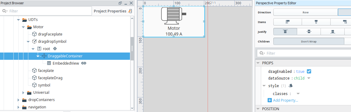
In the Designer, DraggableContainer displays a label showing its state: enabled/disabled, the dataSource mode ([child], [view], or [none]), and whether bindings have been captured (✓ bindings captured).
Captured Binding Configuration Structure
When bindings are captured, the _capturedBindingConfig object contains:
{
  "componentType": "ia.display.view",      // Type of the child component
  "viewPath": "Equipment/PumpStatus",      // Path to the embedded view
  "timestamp": 1706886400000,              // Capture timestamp
  "sourceTagPath": "[default]Pumps/Pump1", // Full tag path to UDT instance
  "sourceTagParam": "path",                // Parameter name holding the path
  "udtType": "Equipment/Pump"              // UDT type name
}
DroppableContainer
The DroppableContainer accepts dragged views and recreates them as embedded views with proper binding configuration. It supports dynamic view selection based on UDT compatibility and can manage multiple views in configurable layouts.
Properties Reference
| Property | Type | Default | Description |
|---|---|---|---|
| dropEnabled | boolean | true | Enables or disables the drop functionality. |
| allowMultipleComponents | boolean | true | When true, multiple views can be dropped into the container. When false, only one view is allowed. |
| componentLayout | string | "horizontal" | Layout direction for multiple views:
"vertical"
"horizontal"
|
| dynamicViewSelection | boolean | true | When true, scans all project views for UDT compatibility. When false, uses the static views list. |
| views | array | [] | Static list of views for selection dialog (only used when dynamicViewSelection is false). |
| dropType | string | "swap" | Behavior when container is occupied (only applies when allowMultipleComponents is false):
"swap"
"keep"
|
| widgets | array | [] | (Managed) Array of widget configurations containing viewPath, viewParams, and propConfig for each dropped view. |
| dragOverStyle | object | (see below) | Custom styles for visual feedback during drag-over state. Renders as an overlay on top of child content. |
| dialogStyle | object | (see below) | Customizable styles for each element of the view selection dialog. Each sub-property uses the full Perspective style-properties schema — supporting classes, colors, fonts, borders, backgrounds, and all CSS properties. |
| canAccept | object | (see below) | Acceptance filter to restrict which drag sources this container accepts. Contains tags, udts, dataTypes filter arrays and a validateOn timing option. See Acceptance Filtering. |
| removeButton | object | (see below) | Configuration for the widget remove button. Supports position (top-left, top-right, bottom-left, bottom-right), icon (Ignition icon path, e.g. material/close), color, size, showOnHover, and enabled. See Remove Button Configuration. |
| style | object | {} | Standard Perspective style object. |
views Array Structure
Each item in the views array (for static mode) should contain:
{
  "name": "Pump Detail View",           // Display name in selection dialog
  "path": "Equipment/Views/PumpDetail"  // Full view path
}
widgets Array Structure
The widgets array is managed automatically and stores:
{
  "viewPath": "Equipment/Views/PumpDetail",
  "viewParams": {
    "path": "[default]Pumps/Pump1"
  },
  "propConfig": {
    "params.path": {
      "binding": {
        "type": "tag",
        "config": { "tagPath": "[default]Pumps/Pump1" }
      },
      "paramDirection": "input",
      "persistent": true
    }
  }
}
dragOverStyle Structure
Visual feedback renders as an absolutely-positioned overlay div on top of all child content, ensuring visibility even when embedded views are loaded inside the container:
{
  "valid": {
    "borderColor": "#4CAF50",                  // Green border for valid drop
    "backgroundColor": "rgba(76, 175, 80, 0.1)"
  },
  "invalid": {
    "borderColor": "#F44336",                  // Red border for invalid drop
    "backgroundColor": "rgba(244, 67, 54, 0.1)"
  }
}
dialogStyle Structure
Each element in dialogStyle uses the Perspective style-properties schema (classes + CSS properties). See the Dialog Style Customization section for the full element reference and examples.
Usage Guide
Basic Configuration
allowMultipleComponents and componentLayout based on your needs.dynamicViewSelection to true for automatic UDT-based view discovery, or false to use a curated views list.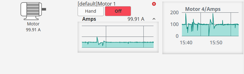
View Selection Dialog
When a view is dropped and multiple compatible views are available, a selection dialog appears:
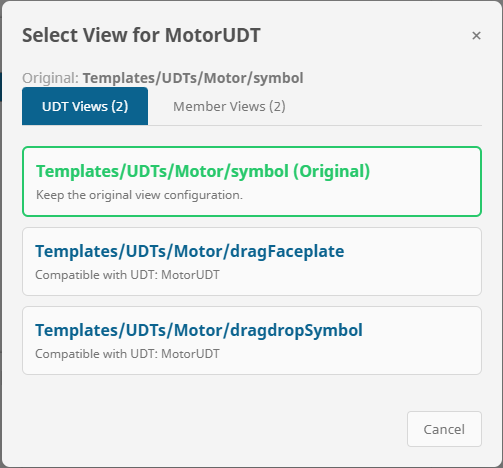
When only one compatible view is found (in static mode), or when the original view is the only option, the drop happens automatically without showing the selection dialog.
dropType Behavior
When allowMultipleComponents is false:
swap: The new view replaces the existing viewkeep: The drop is ignored if a view already exists
The widgets property is managed automatically by the component. Do not manually edit this array unless you understand the expected structure. Invalid entries may cause rendering errors.
DataDropContainer
The DataDropContainer captures tag path data from dropped items without recreating views. It's ideal for building lists of tag paths, populating trend charts, or collecting data references for reports.
Properties Reference
| Property | Type | Default | Description |
|---|---|---|---|
| dropEnabled | boolean | true | Enables or disables the drop functionality. |
| allowMultipleDrops | boolean | true | When true, multiple tag paths can be collected. When false, only the most recent drop is kept. |
| dataSource | string | "dialog" | How dropped data is processed:
"dialog"
"tagpath"
|
| droppedData | array | [] | Array of collected tag paths from dropped items. |
| dragOverStyle | object | (see DroppableContainer) | Custom styles for visual feedback during drag-over state. Renders as an overlay on top of child content. |
| dialogStyle | object | (see below) | Customizable styles for each element of the data selection dialog. Each sub-property uses the full Perspective style-properties schema. |
| canAccept | object | (see below) | Acceptance filter to restrict which drag sources this container accepts. Contains tags, udts, dataTypes filter arrays and a validateOn timing option. See Acceptance Filtering. |
| style | object | {} | Standard Perspective style object. |
dataSource Options Explained
dialog: Shows a selection dialog allowing the user to choose between the full UDT path or individual memberstagpath: Automatically captures the source tag path without user interaction
dialogStyle Structure
Each element uses the Perspective style-properties schema. DataDropContainer supports the same elements as DroppableContainer except originalItem and originalItemTitle. See the Dialog Style Customization section for the full reference.
Usage Guide
Common Use Cases
- Trend Chart Data Sources: Collect tag paths to bind to a trend chart's pens
- Alarm List Filtering: Build a list of equipment paths to filter alarm displays
- Report Parameters: Gather equipment references for report generation
- Comparison Tools: Collect multiple equipment paths for side-by-side data comparison
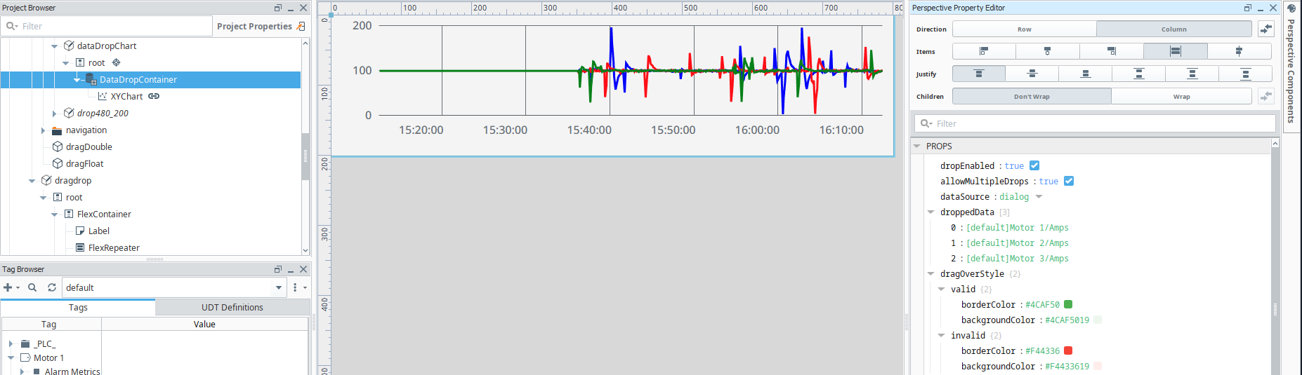
Binding to droppedData
You can bind other components to the droppedData property to react to collected data:
// Example: Binding a Table's data property
{this.view.custom.dataDropContainer.props.droppedData}
When dataSource is set to "dialog", users can select from the full UDT instance path or drill down into specific members. This is useful when you need specific data points rather than the entire UDT reference.
View Configuration
For the drag-and-drop system to work with UDT-aware binding transfer, your views must be properly configured with dropConfig in their view properties.
Setting Up dropConfig
The dropConfig is defined in a view's custom properties and tells the drag-drop system which UDT types the view is compatible with:
props object, add a dropConfig object.dropConfig Structure
// View Props > dropConfig
{
  "udts": [
    {
      "type": "Equipment/Pump",      // UDT type path
      "action": "path",              // Action type (always "path" for binding transfer)
      "param": "path"                // View parameter name that receives the tag path
    },
    {
      "type": "Equipment/Motor",
      "action": "path",
      "param": "equipmentPath"
    }
  ],
  "dataTypes": [
    {
      "type": "Float4",              // Data type name
      "action": "path",
      "param": "valuePath"
    }
  ]
}
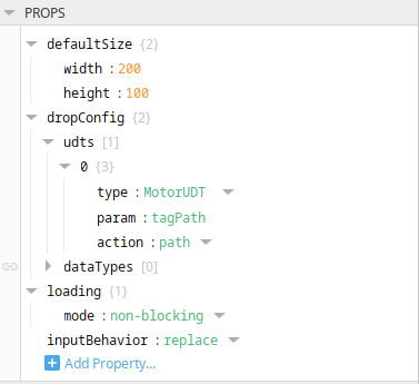
The param value in dropConfig must match an actual parameter defined in the view's params object. The drag-drop system will write the tag path to this parameter.
Dynamic vs Static View Selection
| Mode | Configuration | Best For |
|---|---|---|
DynamicdynamicViewSelection: true |
Scans all project views for matching dropConfig entries at runtime |
Development, flexible systems, when views are frequently added |
StaticdynamicViewSelection: false |
Uses only views defined in the views property array |
Production, controlled environments, curated view sets |
Static View Configuration Example
// DroppableContainer props
{
  "dynamicViewSelection": false,
  "views": [
    {
      "name": "Pump Overview",
      "path": "Equipment/Views/PumpOverview"
    },
    {
      "name": "Pump Detailed Status",
      "path": "Equipment/Views/PumpDetail"
    },
    {
      "name": "Pump Maintenance",
      "path": "Equipment/Views/PumpMaintenance"
    }
  ]
}
For large projects with many views, static mode provides better performance as it avoids scanning all views on each drop. It also gives you explicit control over which views appear in the selection dialog.
Styling & Themes
Customizing Drag-Over Styles
Both DroppableContainer and DataDropContainer support customizable visual feedback during drag operations through the dragOverStyle property:
{
  "dragOverStyle": {
    "valid": {
      "borderColor": "#2196F3",                   // Blue for valid
      "backgroundColor": "rgba(33, 150, 243, 0.15)"
    },
    "invalid": {
      "borderColor": "#9E9E9E",                   // Gray for invalid
      "backgroundColor": "rgba(158, 158, 158, 0.1)"
    }
  }
}
Style States
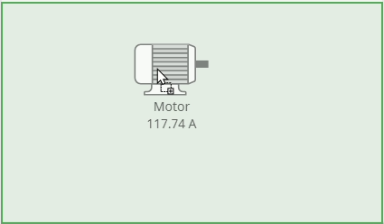
- Valid: Applied when the dragged item can be dropped (correct type, container not full, etc.)
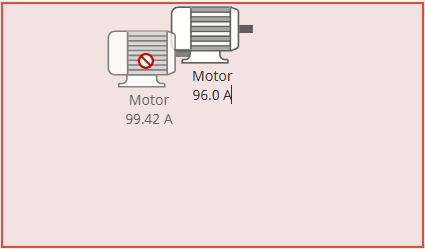
- Invalid: Applied when the drop would not be accepted
Drag-over feedback renders as an absolutely-positioned overlay on top of any child content. This ensures the visual indicator is always visible — even when the container already has embedded views or widgets loaded inside it. The overlay uses pointer-events: none so drag events still pass through to the container beneath.
Dialog Style Customization
Both DroppableContainer and DataDropContainer expose a dialogStyle property for fully customizing the appearance of selection dialogs. Each element within dialogStyle uses the standard Perspective style-properties schema — giving you access to the full style editor in the Designer, including named style classes, colors, fonts, borders, backgrounds, and all CSS properties.
dialogStyle Elements
| Element | Applies To | Key Default Styles |
|---|---|---|
| overlay | The dark backdrop behind the dialog | backgroundColor: rgba(0, 0, 0, 0.5) |
| panel | The main dialog container | backgroundColor: var(--neutral-20), borderRadius: 8px, padding: 20px |
| header | Dialog title text ("Select View for …") | color: var(--neutral-80) |
| subHeader | Subtitle showing the original path | color: var(--neutral-50), fontSize: 14px |
| subHeaderHighlight | The bold path text within the sub-header | color: var(--neutral-60) |
| tabBar | Tab strip container | borderBottom: 1px solid var(--neutral-30) |
| tabActive | Currently selected tab | backgroundColor: var(--callToAction--active), color: white |
| tabInactive | Unselected tabs | backgroundColor: transparent, color: var(--neutral-60) |
| listItem | Each selectable row/card | backgroundColor: var(--neutral-10), border: 1px solid var(--neutral-30) |
| listItemHover | Hover state for list items (merged on top of listItem) | (empty by default — set to enable hover effect) |
| listItemTitle | Bold title text in each list item | fontWeight: bold, color: var(--callToAction--active) |
| listItemDescription | Smaller description text below the title | fontSize: 12px, color: var(--neutral-60) |
| originalItem | "Original" view card highlight (DroppableContainer only) | border: 2px solid var(--indicator) |
| originalItemTitle | Title text for the original item card (DroppableContainer only) | color: var(--indicator) |
| sectionHeader | Member group headers in the Members tab | color: var(--neutral-70), backgroundColor: var(--neutral-10) |
| cancelButton | The Cancel button | backgroundColor: var(--neutral-10), border: 1px solid var(--neutral-30) |
| closeButton | The × close button in the header | color: var(--neutral-60), fontSize: 20px |
| footer | Bottom footer area containing buttons | borderTop: 1px solid var(--neutral-20) |
Style Schema Format
Each element follows the standard Perspective style-properties schema. This means every element accepts a classes string for named style classes, plus any CSS properties as direct keys:
{
  "dialogStyle": {
    "panel": {
      "classes": "my-custom-panel-class",
      "backgroundColor": "#1a1a2e",
      "borderRadius": "12px",
      "fontFamily": "Roboto, sans-serif",
      "boxShadow": "0 20px 40px rgba(0, 0, 0, 0.4)"
    },
    "header": {
      "classes": "",
      "color": "#00ff88",
      "fontSize": "22px"
    },
    "tabActive": {
      "classes": "",
      "backgroundColor": "#0066cc",
      "color": "#ffffff"
    },
    "listItem": {
      "classes": "",
      "backgroundColor": "#2a2a3e",
      "border": "1px solid #444"
    },
    "listItemHover": {
      "classes": "",
      "backgroundColor": "#3a3a5e",
      "border": "1px solid #0066cc"
    }
  }
}
The classes field on each element lets you reference Perspective named style classes. This is the most powerful approach for maintaining consistent theming: define your styles once in the project's Style Classes, then reference them by name in dialogStyle. CSS properties set directly on the element will merge on top of any styles from the named class.
The listItemHover element is merged on top of listItem when the user hovers. Leave it empty (default) for no hover effect, or set specific CSS overrides like backgroundColor and border to provide interactive feedback. Only the properties you set will be overridden during hover.
Layout Configuration
The DroppableContainer's componentLayout property controls how multiple views are arranged:
Table Integration
The DragDrop module integrates seamlessly with Perspective's built-in ia.display.table component. Place a table inside a DraggableContainer or DroppableContainer and the module automatically detects it, enabling cell, row, and column drag-and-drop transfers between tables — no scripting required.
Transfer Modes
The transfer mode is automatically determined from the table's selection properties:
| enableRowSelection | enableColumnSelection | Mode | Behavior |
|---|---|---|---|
| true | true | cell | Drags a single cell value. Drops onto a specific cell in the target table. |
| true | false | row | Drags an entire row. Merges all fields from the source row onto the target row. |
| false | true | column | Drags an entire column. Writes the source column's values into the target column across all rows. |
How It Works
- Source table: Click a cell/row/column to select it, then drag from the DraggableContainer.
- During drag: A mode-appropriate drag image appears (cell value, row fields, or column name with count).
- Hover over target: The target cell or row highlights using the DroppableContainer's
dragOverStyle.validcolors. - Drop: The module automatically finds the target table, matches the hovered row by content (not DOM position), and writes the value via
PropertyTree.write('data', ...).
When two rows have identical content (e.g., two "San Francisco" rows), the module tracks which occurrence in the DOM the user hovered over and writes to the correct row in the data array.
When both source and target tables are in DraggableContainer/DroppableContainer pairs, the module automatically disambiguates using the source's viewMountPath to ensure writes go to the target table, never the source.
onDrop Event Data (Table Mode)
The onDrop event on the DroppableContainer includes these table-specific properties:
| Property | Type | Description |
|---|---|---|
| transferType | string | "table-row-transfer" — identifies this as a table transfer |
| mode | string | "cell", "row", or "column" |
| selectionData | array | The table's selection.data — the primary payload, varies by mode |
| sourceColumn | string | Column name in the source table (e.g., "city") |
| sourceCellValue | any | The selected cell's value in the source table |
| sourceRowData | object | Full row object from the source table |
| targetColumn | string | Column name in the target table where the drop occurred |
| targetCellValue | any | The original value in the target cell before the write |
| targetRowContent | object | All column values for the target row, extracted from the DOM (e.g., {city: "Madrid", country: "Spain", population: "3,233,527"}) |
| writeSuccess | boolean | Whether the auto-write to the target table succeeded |
Acceptance Filtering
The canAccept property on DroppableContainer and DataDropContainer lets you restrict which drag sources the container will accept. When no filters are configured (all arrays empty), the container accepts everything — fully backwards compatible.
canAccept Structure
| Property | Type | Default | Description |
|---|---|---|---|
| tags | string[] | [] | Tag path prefixes. The source's sourceTagPath must start with one of these values. Supports both exact match and prefix match (e.g., [default]Pumps/ accepts all tags under that folder). |
| udts | string[] | [] | UDT type names. The source's udtType must exactly match one of these values (e.g., Equipment/Pump). |
| dataTypes | string[] | [] | Ignition data types (Int4, Float8, Boolean, String, DateTime, etc.). The source's transfer type must match one of these. |
| validateOn | string | "onDrop" | When to evaluate the filter:
"onDragOver"
"onDrop"
onDragOver: Shows invalid drag-over styling in real time as the user hovers. onDrop: Looks valid while hovering, rejects at drop time.
|
Non-empty categories use AND logic between them (all must pass) and OR logic within each category (at least one must match). Empty categories are skipped entirely.
// Example: Only accept pump UDTs from the Pumps tag folder
{
  "tags": ["[default]Equipment/Pumps/"],
  "udts": ["Equipment/Pump", "Equipment/VFDPump"],
  "dataTypes": [],
  "validateOn": "onDragOver"
}
Move & Copy
The DraggableContainer's dragType property controls what happens to the source widget after a successful drop.
Behavior
| dragType | On Successful Drop | Use Case |
|---|---|---|
| copy (default) | Source widget stays in place | Template palettes, cloning views, duplicating configurations |
| move | Source widget is automatically removed from its parent DroppableContainer | Kanban boards, layout rearrangement, resource allocation interfaces |
dragType: "move" only works when the DraggableContainer is inside a DroppableContainer that manages a widgets array. If the DraggableContainer is a standalone component, move has no effect (the onDragEnd event will report moveSuccess: false).
The onDragEnd event includes:
{
  "dropEffect": "copy",
  "wasDropped": true,
  "dragType": "move",
  "moveSuccess": true     // true if the widget was removed from its parent
}
Data Transfer
One of the most powerful features of this module is the ability to preserve and transfer tag DropConfig's when views are dragged between containers.
How Data Transfer Works
When a view is selected that is compatible with a UDT member (not the whole UDT), the tag path is automatically extended to include the member path. For example, if the source is [default]Pumps/Pump1 and you select a view compatible with the "Status" member, the tag path becomes [default]Pumps/Pump1/Status.
UDT Integration
UDT Structure Communication
The DroppableContainer and DataDropContainer communicate with the Gateway to retrieve UDT structure information. This is handled through a ComponentStoreDelegate that fires events to the Gateway-side ComponentModelDelegate.
Gateway-Side Requirements
Your module must implement a ComponentModelDelegate that handles the getUdtStructure event:
// Gateway-side delegate handles:
// Event: "getUdtStructure" with payload { tagPath: string }
// Response: "udtStructureResponse" with payload { members: {...} }
UDT Structure Response Format
{
  "members": {
    "Status": {
      "dataType": "Int4",
      "members": null
    },
    "Speed": {
      "dataType": "Float4",
      "members": null
    },
    "Controller": {
      "dataType": "Equipment/PID",  // Nested UDT
      "members": {
        "SetPoint": { "dataType": "Float4" },
        "ProcessValue": { "dataType": "Float4" }
      }
    }
  }
}
Component Events
The Drag & Drop Module provides a comprehensive set of component events that allow you to respond to drag-and-drop operations using Python scripts. These events fire at key moments during the drag-drop lifecycle, giving you full control over custom behaviors such as implementing move operations, logging, analytics, or conditional logic.
Component events integrate seamlessly with Perspective's scripting system. Each event provides a rich event object containing relevant context about the drag-drop operation, enabling you to build sophisticated HMI workflows.
Many events include an originContext (or sourceOriginContext / targetOriginContext) object that exposes the full view hierarchy chain. This is essential for identifying components across deeply nested embedded views. The structure contains:
viewMountPath— The internal mount path of the view (e.g."C$0:0:1")viewResourcePaths— Array of view resource paths from page root to the current view (e.g.["MainPage", "Equipment/Dashboard", "Widgets/PumpCard"])pageViewPath— The top-level page view pathinstanceId— Unique identifier for this component instance
DraggableContainer Events
DraggableContainer fires events at the start and end of drag operations, providing information about the dragged content and the outcome of the operation.
onDragStart
Fired when a drag operation begins from this container. Use this event to perform actions when a user starts dragging content.
| Property | Type | Description |
|---|---|---|
| sourceComponentPath | string | The component path of this DraggableContainer (the drag origin) |
| sourceViewPath | string | The view path containing this container |
| draggedViewPath | string | The path of the view being dragged |
| sourceTagPath | string | The tag path associated with the dragged content (if applicable) |
| udtType | string | The UDT type of the dragged content (if applicable) |
| dataSource | string | The dataSource mode used: 'child', 'view', or 'none' |
| timestamp | integer | Timestamp when the drag started (milliseconds since epoch) |
| widgetIndex | integer | Index of the widget being dragged (if part of a widgets array) |
| originContext | object | Full view hierarchy context of this DraggableContainer. Contains viewMountPath, viewResourcePaths (array from page root to this view), pageViewPath, and instanceId. |
onDragEnd
Fired when a drag operation ends from this container. This event includes information about whether the drop was successful, enabling move operation implementations.
| Property | Type | Description |
|---|---|---|
| sourceComponentPath | string | The component path of this DraggableContainer |
| sourceViewPath | string | The view path containing this container |
| draggedViewPath | string | The path of the view that was being dragged |
| sourceTagPath | string | The tag path associated with the dragged content (if applicable) |
| dataSource | string | The dataSource mode used: 'child', 'view', or 'none' |
| timestamp | integer | Timestamp when the drag ended (milliseconds since epoch) |
| dropEffect | string | The drop effect that occurred: 'copy', 'move', or 'none' |
| wasDropped | boolean | Whether the drag operation resulted in a successful drop |
| dragType | string | The configured drag type: "copy" or "move" |
| moveSuccess | boolean | Whether the source widget was successfully removed from its parent DroppableContainer. Only relevant when dragType is "move". |
| originContext | object | Full view hierarchy context of this DraggableContainer. Same structure as onDragStart's originContext. |
When dragType is "move" and wasDropped is true, the module automatically removes the source widget — no scripting needed. Check moveSuccess to verify the removal succeeded. See Move & Copy for details.
DroppableContainer Events
DroppableContainer fires events throughout the drag-over and drop lifecycle, providing detailed information about the incoming content and drop operation results.
onDragEnter
Fired when a dragged item first enters this container's bounds. Use this for visual feedback initialization or validation checks.
| Property | Type | Description |
|---|---|---|
| targetComponentPath | string | The component path of this DroppableContainer (the drop target) |
| targetViewPath | string | The view path containing this container |
| sourceViewPath | string | The path of the view being dragged |
| sourceTagPath | string | The tag path associated with the dragged content (if applicable) |
| udtType | string | The UDT type of the dragged content (if applicable) |
| isValidDrop | boolean | Whether this container can accept the current drag data |
| currentWidgetCount | integer | Current number of widgets in this container |
| allowMultipleComponents | boolean | Whether this container allows multiple components |
| timestamp | integer | Timestamp when drag entered (milliseconds since epoch) |
| targetOriginContext | object | Full view hierarchy context of this drop target. Contains viewMountPath, viewResourcePaths (array from page root to this view), pageViewPath, and instanceId. |
| sourceOriginContext | object | Full view hierarchy context of the drag source. Same structure as targetOriginContext. Useful for determining the origin across nested embedded views. |
onDragOver
Fired continuously while a dragged item is positioned over this container. This event is throttled (fires at most every 100ms) to prevent performance issues.
| Property | Type | Description |
|---|---|---|
| targetComponentPath | string | The component path of this DroppableContainer |
| isValidDrop | boolean | Whether this container can accept the current drag data |
| x | number | X coordinate relative to the container |
| y | number | Y coordinate relative to the container |
| timestamp | integer | Timestamp of this event (milliseconds since epoch) |
The onDragOver event fires frequently. Avoid expensive operations in this handler. Use onDragEnter for one-time checks and onDrop for final processing.
onDragLeave
Fired when a dragged item leaves this container's bounds without being dropped.
| Property | Type | Description |
|---|---|---|
| targetComponentPath | string | The component path of this DroppableContainer |
| targetViewPath | string | The view path containing this container |
| sourceViewPath | string | The path of the view that was being dragged |
| timestamp | integer | Timestamp when drag left (milliseconds since epoch) |
| targetOriginContext | object | Full view hierarchy context of this drop target. |
| sourceOriginContext | object | Full view hierarchy context of the drag source. |
onDrop
Fired when a dragged item is successfully dropped on this container. This is the most important event for implementing custom drop logic, including move operations.
| Property | Type | Description |
|---|---|---|
| targetComponentPath | string | The component path of this DroppableContainer (destination) |
| targetViewPath | string | The view path containing this container |
| sourceComponentPath | string | The component path of the source DraggableContainer (origin) - critical for move operations |
| sourceViewPath | string | The view path containing the source container |
| droppedViewPath | string | The path of the view that was dropped |
| selectedViewPath | string | The view path selected (may differ from original if user selected alternative) |
| sourceTagPath | string | The tag path associated with the dropped content |
| udtType | string | The UDT type of the dropped content |
| sourceParamName | string | The parameter name used for the source tag binding |
| widgetIndex | integer | Index where the widget was added in the widgets array |
| previousWidgetCount | integer | Number of widgets before the drop |
| newWidgetCount | integer | Number of widgets after the drop |
| dropMode | string | The drop mode: 'add', 'swap', or 'rejected' |
| wasSwapped | boolean | Whether an existing widget was replaced during this drop |
| timestamp | integer | Timestamp when the drop occurred |
| dragData | object | The complete drag data object for advanced scripting needs |
| targetOriginContext | object | Full view hierarchy context of this drop target. |
| sourceOriginContext | object | Full view hierarchy context of the drag source. |
When the drop is a table-to-table transfer (transferType: "table-row-transfer"), the onDrop event includes additional properties: mode, selectionData, sourceColumn, targetColumn, targetRowContent, writeSuccess, and more. See Table Integration for the full list.
DataDropContainer Events
DataDropContainer fires similar events to DroppableContainer, but is optimized for capturing tag path data without recreating embedded views.
onDragEnter
Fired when a dragged item first enters this container's bounds.
| Property | Type | Description |
|---|---|---|
| targetComponentPath | string | The component path of this DataDropContainer |
| targetViewPath | string | The view path containing this container |
| sourceTagPath | string | The tag path associated with the dragged content |
| udtType | string | The UDT type of the dragged content |
| isValidDrop | boolean | Whether this container can accept the current drag data |
| currentDataCount | integer | Current number of data items in this container |
| allowMultipleDrops | boolean | Whether this container allows multiple data drops |
| timestamp | integer | Timestamp when drag entered |
| targetOriginContext | object | Full view hierarchy context of this DataDropContainer. |
| sourceOriginContext | object | Full view hierarchy context of the drag source. |
onDragOver
Fired continuously while a dragged item is over this container (throttled to every 100ms).
| Property | Type | Description |
|---|---|---|
| targetComponentPath | string | The component path of this DataDropContainer |
| isValidDrop | boolean | Whether this container can accept the current drag data |
| x | number | X coordinate relative to the container |
| y | number | Y coordinate relative to the container |
| timestamp | integer | Timestamp of this event |
onDragLeave
Fired when a dragged item leaves this container without being dropped.
| Property | Type | Description |
|---|---|---|
| targetComponentPath | string | The component path of this DataDropContainer |
| targetViewPath | string | The view path containing this container |
| timestamp | integer | Timestamp when drag left |
| targetOriginContext | object | Full view hierarchy context of this DataDropContainer. |
| sourceOriginContext | object | Full view hierarchy context of the drag source. |
onDrop
Fired when data is dropped on this DataDropContainer.
| Property | Type | Description |
|---|---|---|
| targetComponentPath | string | The component path of this DataDropContainer |
| targetViewPath | string | The view path containing this container |
| droppedData | string | The data that was dropped (typically a tag path) |
| sourceTagPath | string | The source tag path from the dragged item |
| udtType | string | The UDT type of the dropped data |
| dataIndex | integer | Index where the data was added in the droppedData array |
| previousDataCount | integer | Number of data items before the drop |
| newDataCount | integer | Number of data items after the drop |
| timestamp | integer | Timestamp when the drop occurred |
| targetOriginContext | object | Full view hierarchy context of this DataDropContainer. |
| sourceOriginContext | object | Full view hierarchy context of the drag source. |
Troubleshooting
❌ Common Issues
Cause: The target views don't have matching dropConfig entries, or they have bound parameters in their propConfig.
Solution: Ensure your views have proper dropConfig with matching UDT types. Views with existing parameter bindings in propConfig are intentionally excluded.
Cause: DraggableContainer has no child component or dragEnabled is false.
Solution: Add an Embedded View as a child component and ensure dragEnabled is true.
Cause: The source view doesn't have dropConfig configured, or the dataSource mode is set incorrectly.
Solution: Add dropConfig to your source view's props and verify the dataSource setting matches your setup (child vs view).
Cause: Container is full and dropType is "keep", or dropEnabled is false.
Solution: Either clear existing widgets, change dropType to "swap", or enable allowMultipleComponents.
Debug Tips
- Verify Designer labels: DraggableContainer shows its current state and captured bindings in the Designer
- Inspect widgets array: Check the DroppableContainer's widgets property to see what's been dropped
- Test with simple views first: Start with views that have minimal configuration before adding complex bindings
Getting Help
If you encounter issues not covered in this documentation:
- Contact our support department at Support
- Check the Ignition forums for community assistance
- Still no luck? - DM our CEO on LinkedIn: Markus Oosthuizen